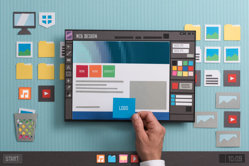
Having a unique and exciting website can help attract larger and more diverse audiences, which is essential to gain more leads. This is why having a good design for your website matters. There are many web design trends for 2022 that you can use as your guide to creating a more appealing website. Whether you’re an entrepreneur who wants to receive more website visits or a web designer aiming to achieve fresher and modern creations, it’s time to learn new ideas from the experts.
2022 Web Design Trends
Are you excited to learn new ideas perfect for web design creation? Whether you have decided to pursue a one-page site or build multiple pages, here are web design trends that can help you achieve your dream website:
Abstract Illustrations or Three-Dimensional Design Elements?
It is important to add images to your website. But which should you use? Should you go for plain images, abstract illustrations, or try three-dimensional elements? The good news is you can merge these trends to incorporate aspects of 3D with a flatter overall aesthetic.
Is Bigger and Bolder Typography Better?
Fonts matter on a website. Depending on the size, font type, and color you use, they can make or break your website. You can play with fonts, but make sure to be creative with them. More extensive and bolder typography works well to highlight valuable information. You can also incorporate it with oversized pointers or mouse hovers, providing useful usability information to your visitors. As such, you can help them better engage with the design.
Playing With Glass Morphism
Have you ever heard of glass morphism? This trend has started with neomorphism in late 2020 and early 2021. But it has evolved into the complete glass effect, which refers to design elements that look reminiscent of glass. Depending on your preference, you can add aspects of transparency, frostiness, or glossiness.
The Aesthetics of Layered Effects
Another trend you can try this year is stacking or overlapping emerging elements to establish connectivity between design elements. Doing so also creates a depth effect. Try using multiple layers, including background, mid-, and foregrounds, then put them together as various elements in a visually exciting and meaningful way.
The Significance of Fun, Colorful, and Gender-neutral Designs
The colors and shapes you will be using when designing a website play a vital role in the site’s overall appeal. You can use funky shapes and colors to create fun and festive designs. If you have a specific target gender, you can use feminine colors such as pink, orange, and yellow. For men, you can use shades of blue and green. Gender-neutral designs are better if both men and women are your target market.
Some of you might ask, do black and white color schemes don’t work? Well, they do, but you have to be creative when using this color scheme. It might be intimidating at first, but the results are excellent once you have creatively played with black and white. Make sure to consider designs within constraints.

The Advantages of Having A One-Page Website
Now that we’ve learned some 2022 web design trends, it’s vital to know how many website pages you want to have. Usually, a website has many pages leading you to the site’s different sections, including About, Contact, Frequently Asked Questions (FAQs), and a lot more. But these past few years, web design experts have realized that having a one-page website also works. Here’s why:
1. Boosts user engagement
As a business owner, enhancing a website user experience matters. You can do this with one-page websites because they can deliver messages and calls-to-action to users faster than multiple-page websites. What most users love about one-page websites is their accessibility since they don’t have to look far when checking the About section or finding a contact form. As such, they are more likely to stay on your website than have subpages.
2. Requires less maintenance
Maintaining a website could be expensive, depending on how complicated it is. If you’re a small-scale business owner who wants to save more money, you can start with one-page websites because they are more affordable to build and maintain. You can even create a one-page site from 10 to 15 hours, but building a multi-page site could take triple the amount.
3. Works well with images
The good thing about a one-page website is it works well with images, which can help you place a good SEO ranking. A website will be boring without pictures, but having too many photos can cause website loading to slow down. As long as you use high-quality images and correctly name them, you can improve your ranking in search results on Google.
2022 web design trends come in and out based on what users prefer. If you don’t know what to add to your website or simply want to enhance it to attract more audience, you can try fresher ideas to make your website an exciting and appealing look. But remember, design is not the only thing that attracts users because content also matters. So make sure you have valuable content and vital information to help them find what they are looking for in your website.

